< Components />
Page Banner Component
The Page Banner Component is an easy to use good looking banner to help you get started out of the box. It allows you to easily update the Pre title text, Title text, Sub title text, button color, text alignment, and overlay.

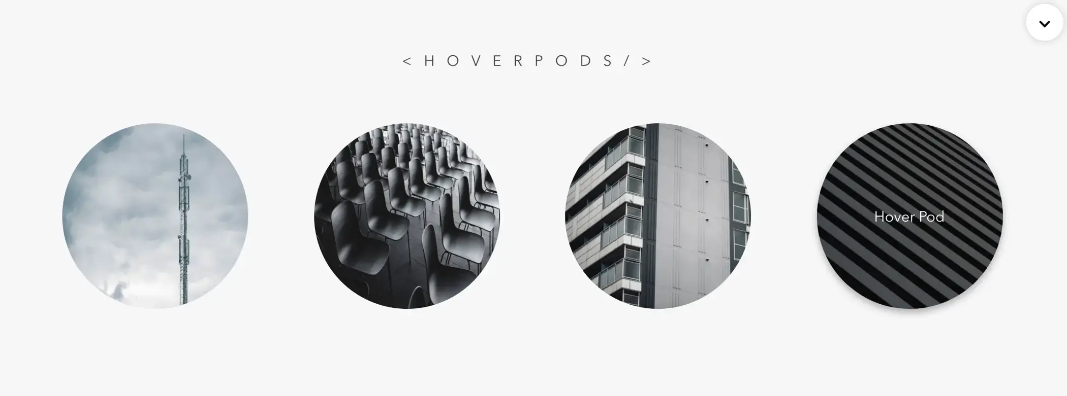
Hover Pods Component
The Hover Pods Component is a creative way to make clickable links with a simple hover animation. The changeable props are background hover color, text color, squared format, open tab on click.
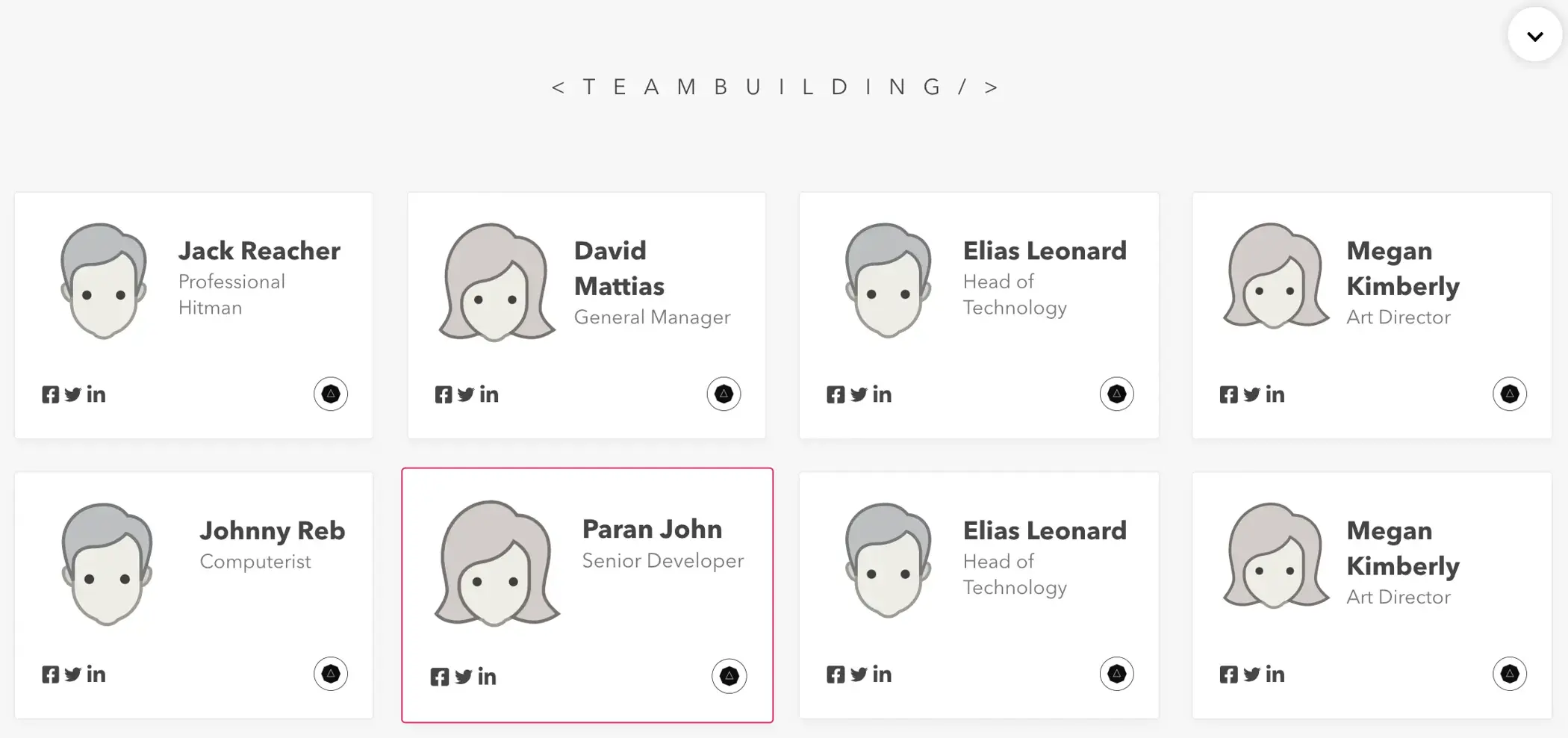
Team Building Component
The Team Building Component is simple component that can create a user/team member card with a simple hover animation. It has an alt layout prop, and you can pass an object to dynamically represent each card.
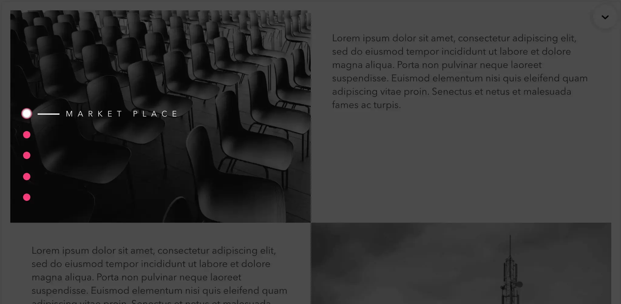
Happy Dots Component
The Happy Dots Component is simple component that can create a scrollable menu with a simple hover animation. It has a ref prop, dot color prop, text color prop, and you can pass an object to dynamically represent each dot as well.
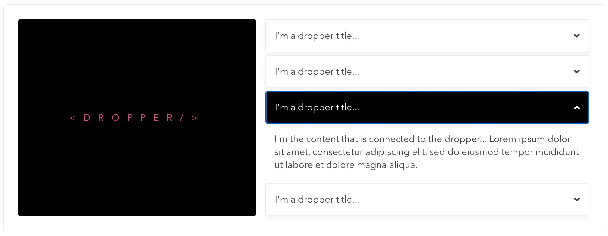
Dropper Component
The Dropper Component is simple component that can create a simple dropdown with a simple hover and click animation. It takes a title prop and passes the content as children
Easy Slider Component
The Easy Slider Component is simple component that can create a simple image slider with a simple hover animation. It takes a title prop and passes the content as children